Procter & Gamble
.png)
Tools
Figma
Illustrator
Photoshop
Keyshot
Solidworks
Google Analytics
Illustrator
Photoshop
Keyshot
Solidworks
Google Analytics
Time Frame
3 Months
Summer 2021
Summer 2021
Collaborators
Individual
Advised By:
Andy Zilch
Kyra Wilson-houck
Kara Young
Tuscan Duckro
Advised By:
Andy Zilch
Kyra Wilson-houck
Kara Young
Tuscan Duckro
Over the course of 3 months, I had the privilege to work on a series of 4 projects, ranging from UX mobile designs for EC30 to developing assets and concepts for early stage projects.
.png)
What is EC30?
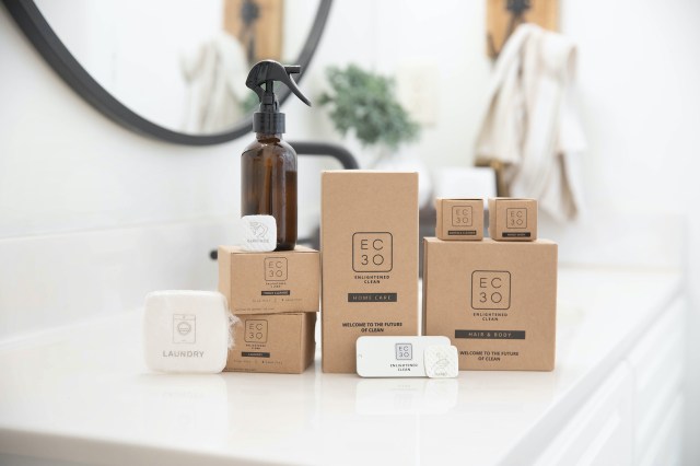
EC30 is a sustainable start-up brand under Procter & Gamble for Home and Personal Care products. They aim to follow a carbon neutral business model by reducing the usage of water and plastics in their products.
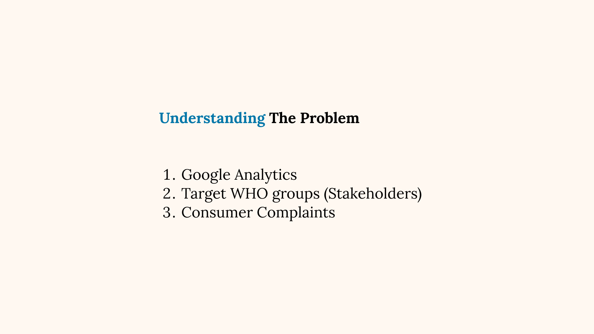
The Problem
When I joined the team, one of EC30s main problems was that they had low website visitor conversion rates, where many people were clicking into webpages but little are following through with purchases.
My role was to identify pain points that can help improve the user experience on EC30s website and mock-up improvements that can be potentially be implemented for A/B testing.
My role was to identify pain points that can help improve the user experience on EC30s website and mock-up improvements that can be potentially be implemented for A/B testing.
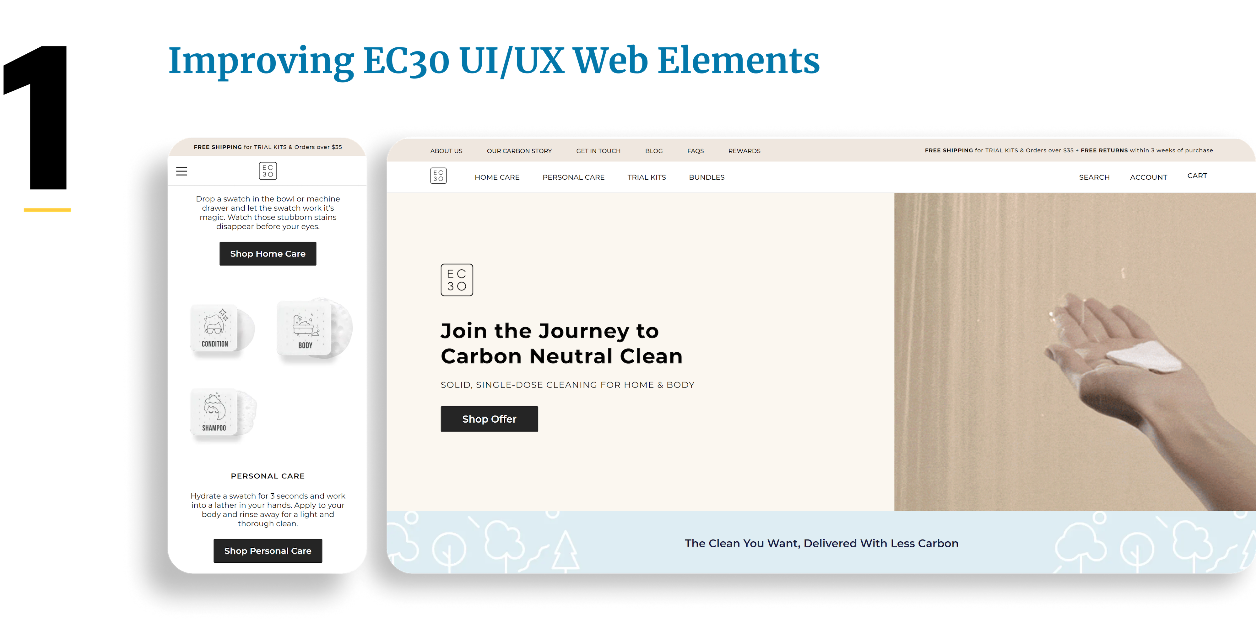
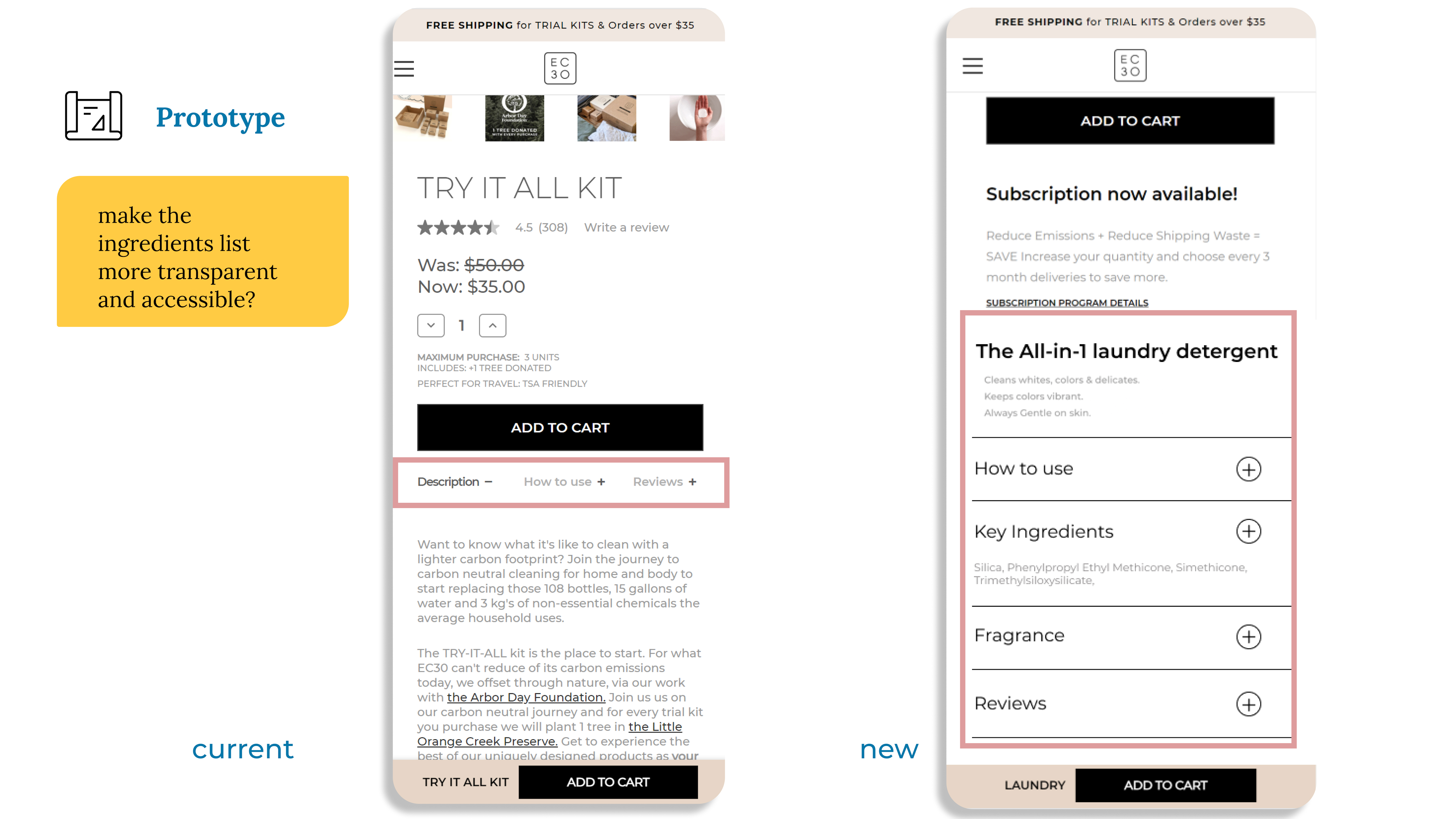
The Mobile Re-design
I focused on re-designing various aspects on a product page, as product pages have the highest amount of traffic on the website.
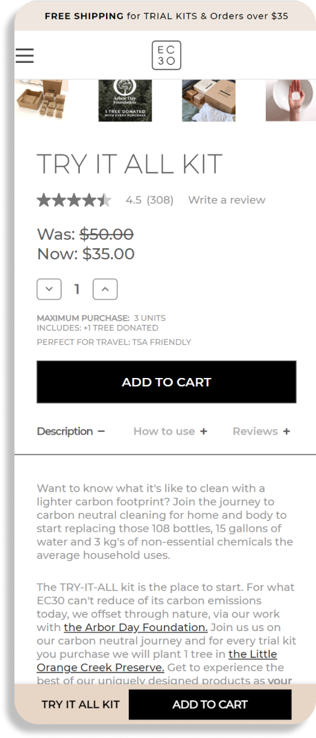
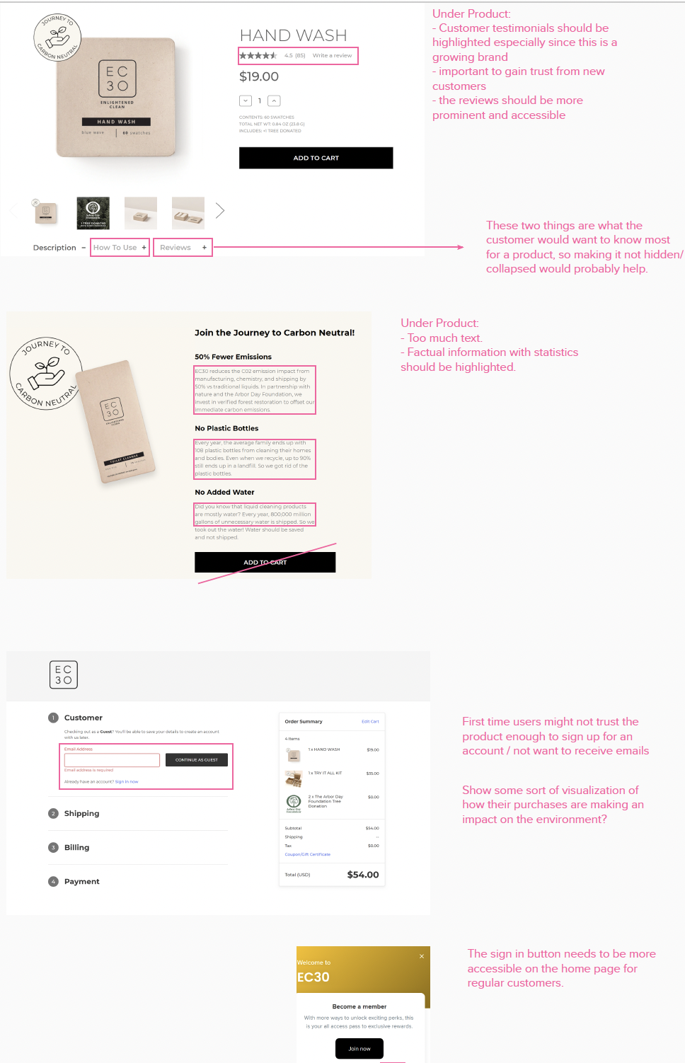
Old (Left)
Important information such as "description", "how to use", "reviews" are not legible.
There is too much text in the description.
Important information such as "description", "how to use", "reviews" are not legible.
There is too much text in the description.
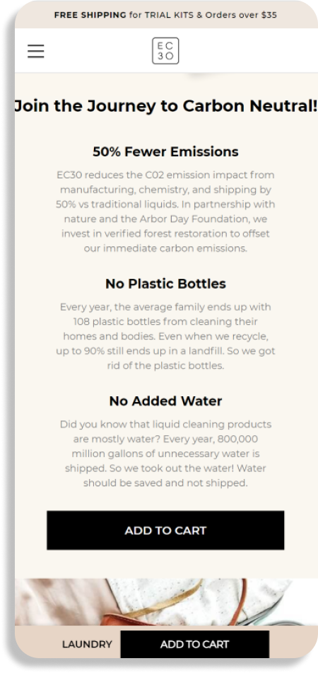
New (Right)
Bigger font size with a vertical stack layout that.
Iconography replaces the information on sustainability, which is instead hidden behind the question mark icon.
Bigger font size with a vertical stack layout that.
Iconography replaces the information on sustainability, which is instead hidden behind the question mark icon.
.gif)
.png)
.gif)
.gif)
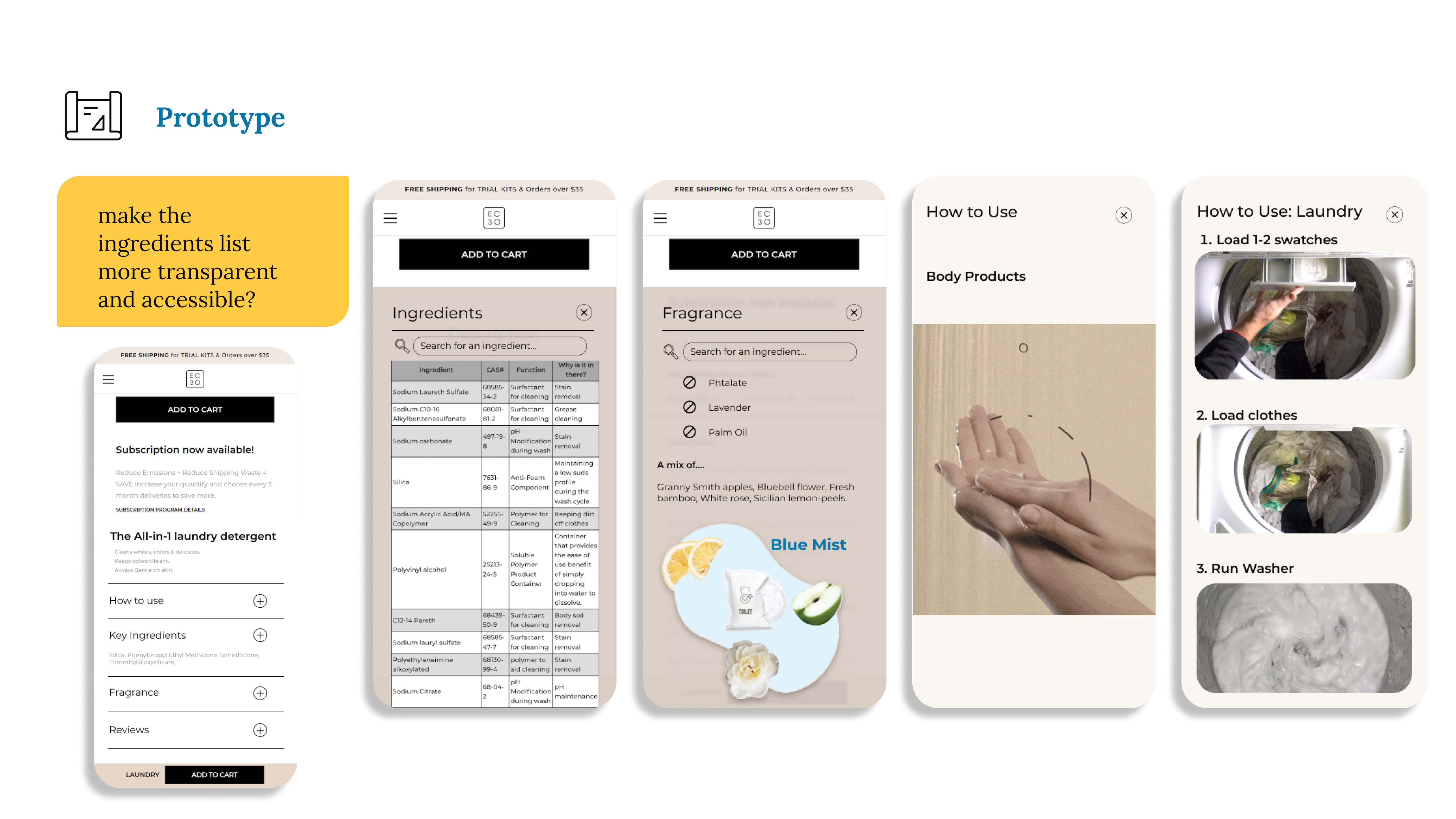
Ingredients
One goal for the re-design is to make the ingredients list more transparent and accessible to our users, hence a comprehensive list is a newly added section under the product page.
One goal for the re-design is to make the ingredients list more transparent and accessible to our users, hence a comprehensive list is a newly added section under the product page.
.gif)
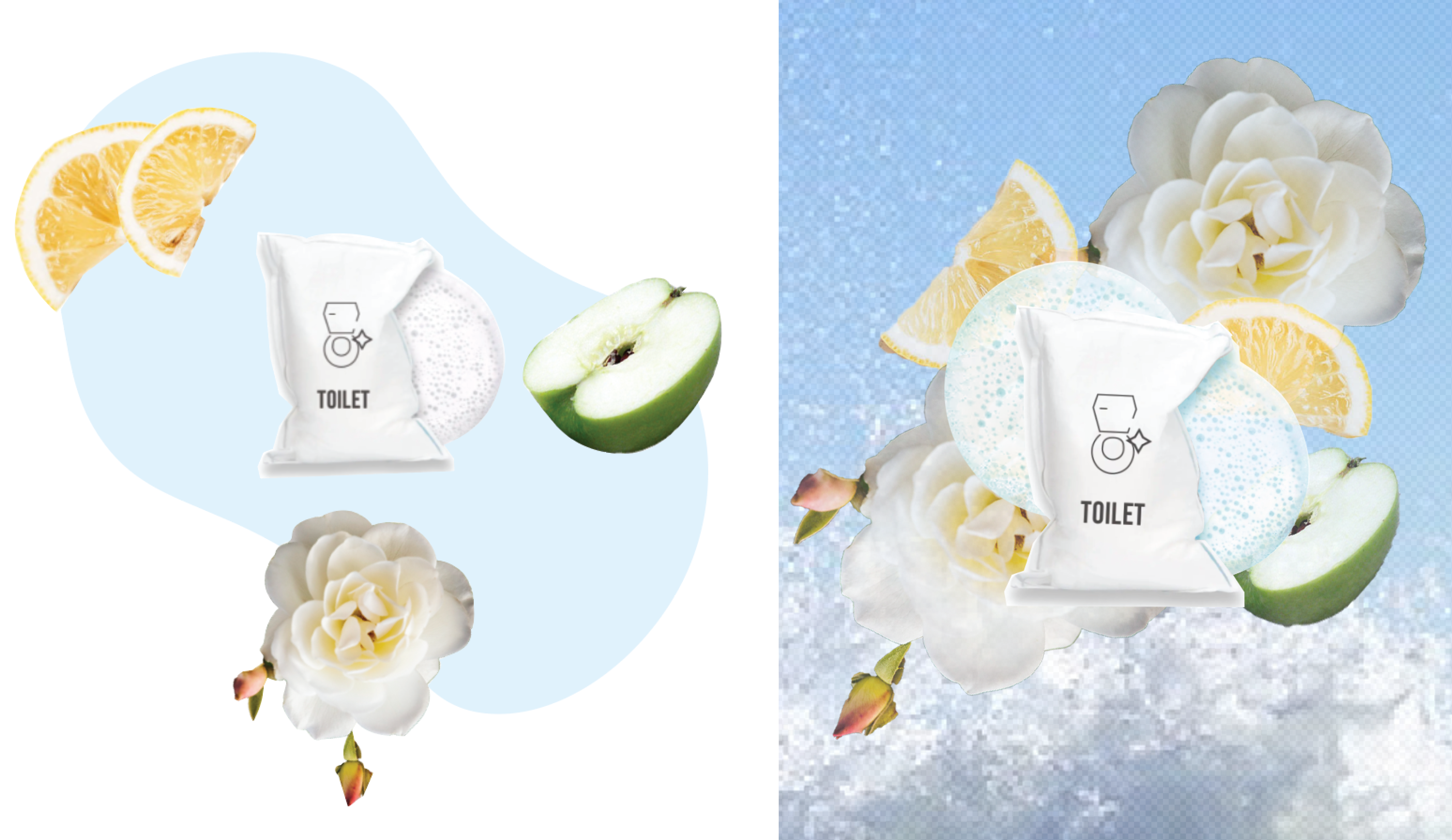
Fragrance Description
Another new feature is describing the product's fragrance. Reviewing consumer feedback, many were surprised to find out that EC30 products have a strong scent. This section aims to better describe the scent through visual imagery and breakdown the chemicals that make up the fragrance.
Another new feature is describing the product's fragrance. Reviewing consumer feedback, many were surprised to find out that EC30 products have a strong scent. This section aims to better describe the scent through visual imagery and breakdown the chemicals that make up the fragrance.
.gif)
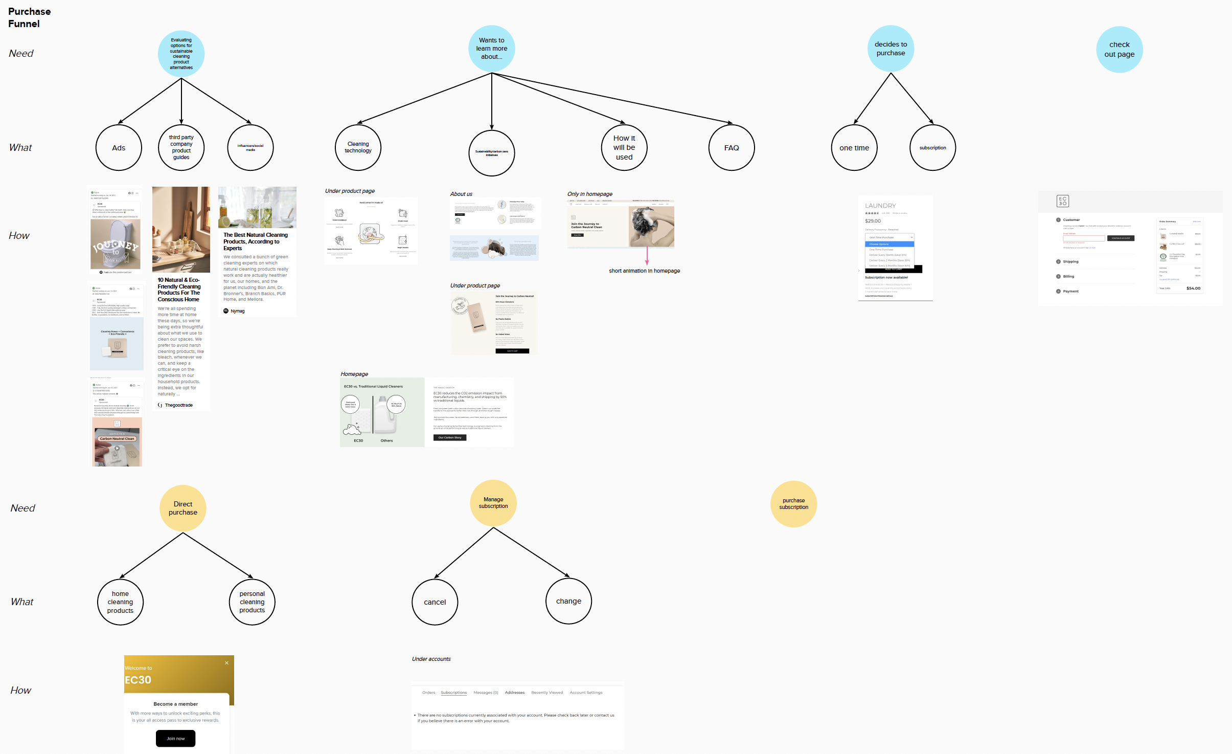
The Design Process
Analyzing Consumer Data
Looking at the data from Google Analytics,
I made the assumption that information hierarchy and placement was one of the causes for such a high drop off rate on important product pages.
I made the assumption that information hierarchy and placement was one of the causes for such a high drop off rate on important product pages.
.png)
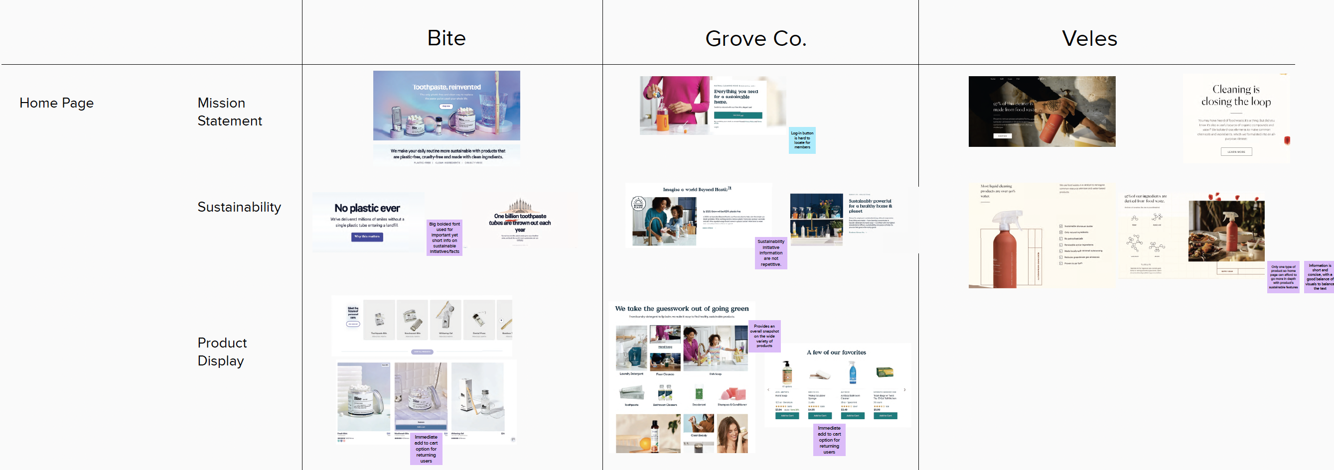
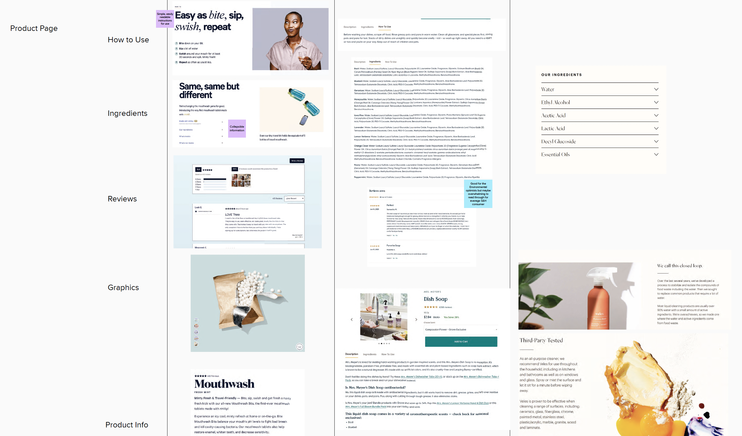
Brand Landscaping
In order to understand how to improve the UI, I did some competitive brand analysis to see what types of information are prioritized over others.
Findings
Distinctive font hierarchy
Condensed text
Clear product display on landing screen
Direct links to prouduct purchases.
Findings
Distinctive font hierarchy
Condensed text
Clear product display on landing screen
Direct links to prouduct purchases.
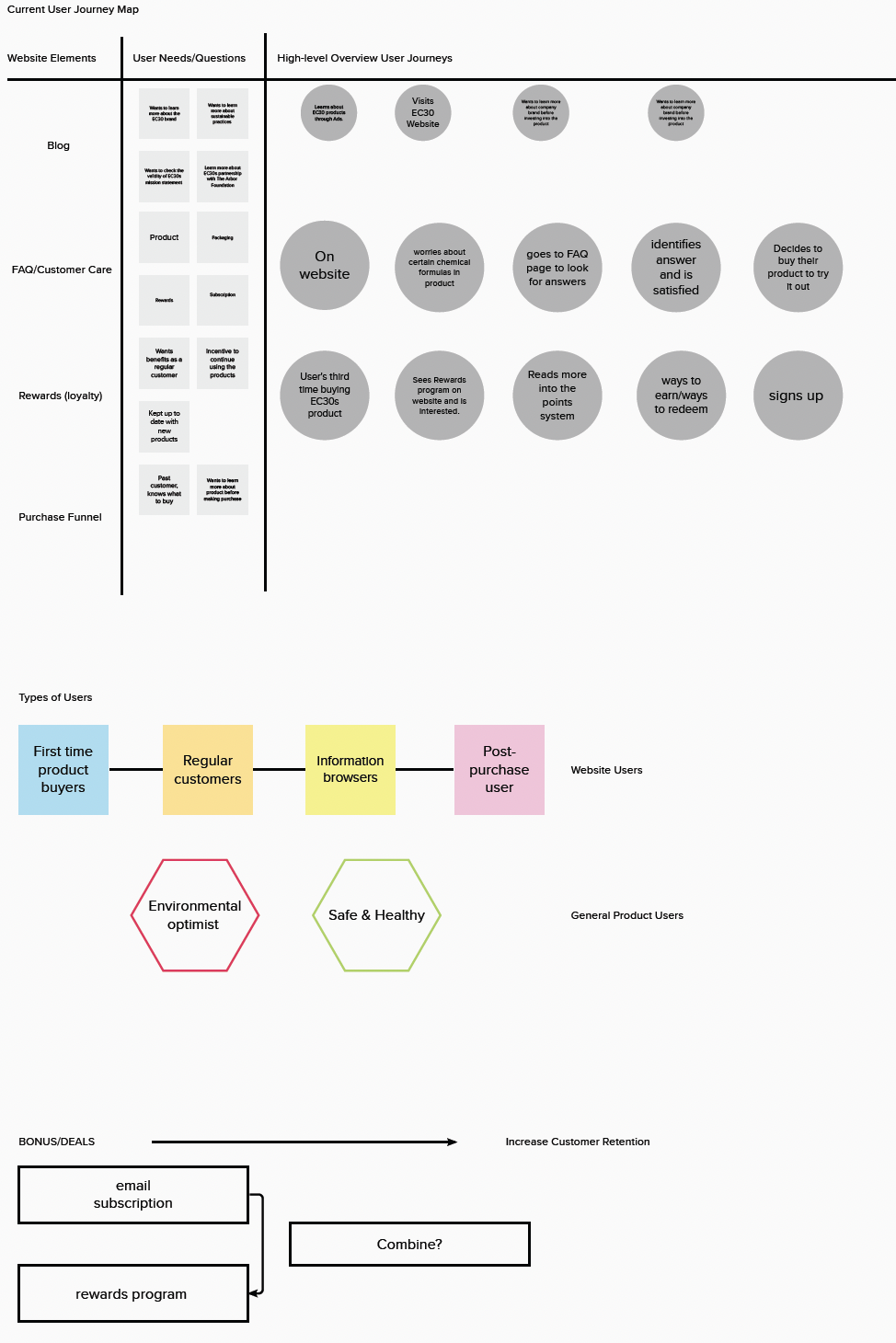
Analyzing the existing user flow
I did an initial first impression analysis of the entire website where I annotated possible opportunities for improvements.
Created several journey maps for different web elements that highlight the user's needs and concerns. This helped me understand which features to focus improving user experience for.
Created several journey maps for different web elements that highlight the user's needs and concerns. This helped me understand which features to focus improving user experience for.
Home Page Redesign
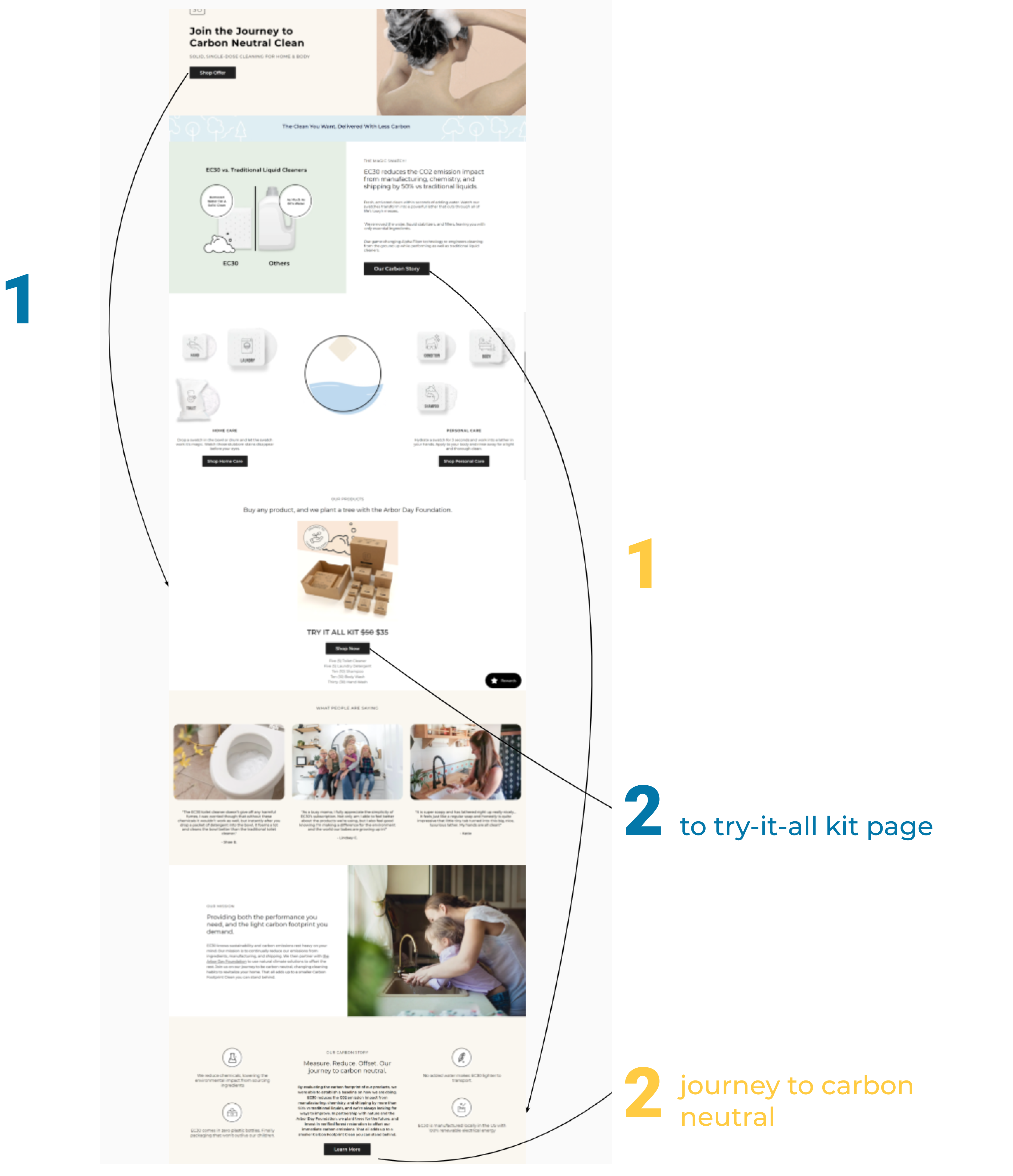
Initial Assumptions
There is too much text that describes how their products are sustainable, and not enough visual cues to communicate this important information quicker.
Click buttons don’t efficiently direct users to the desired content, the numbers indicate the how many steps it takes for the user to get to the page indicated on the button.
.png)
Redesign
Direct links to specific pages
Drive traffic on website
Decrease drop-off rate
Top sellers section
Better use of product info display
Quick add to cart option
Displays product popularity
Direct links to specific pages
Drive traffic on website
Decrease drop-off rate
Top sellers section
Better use of product info display
Quick add to cart option
Displays product popularity
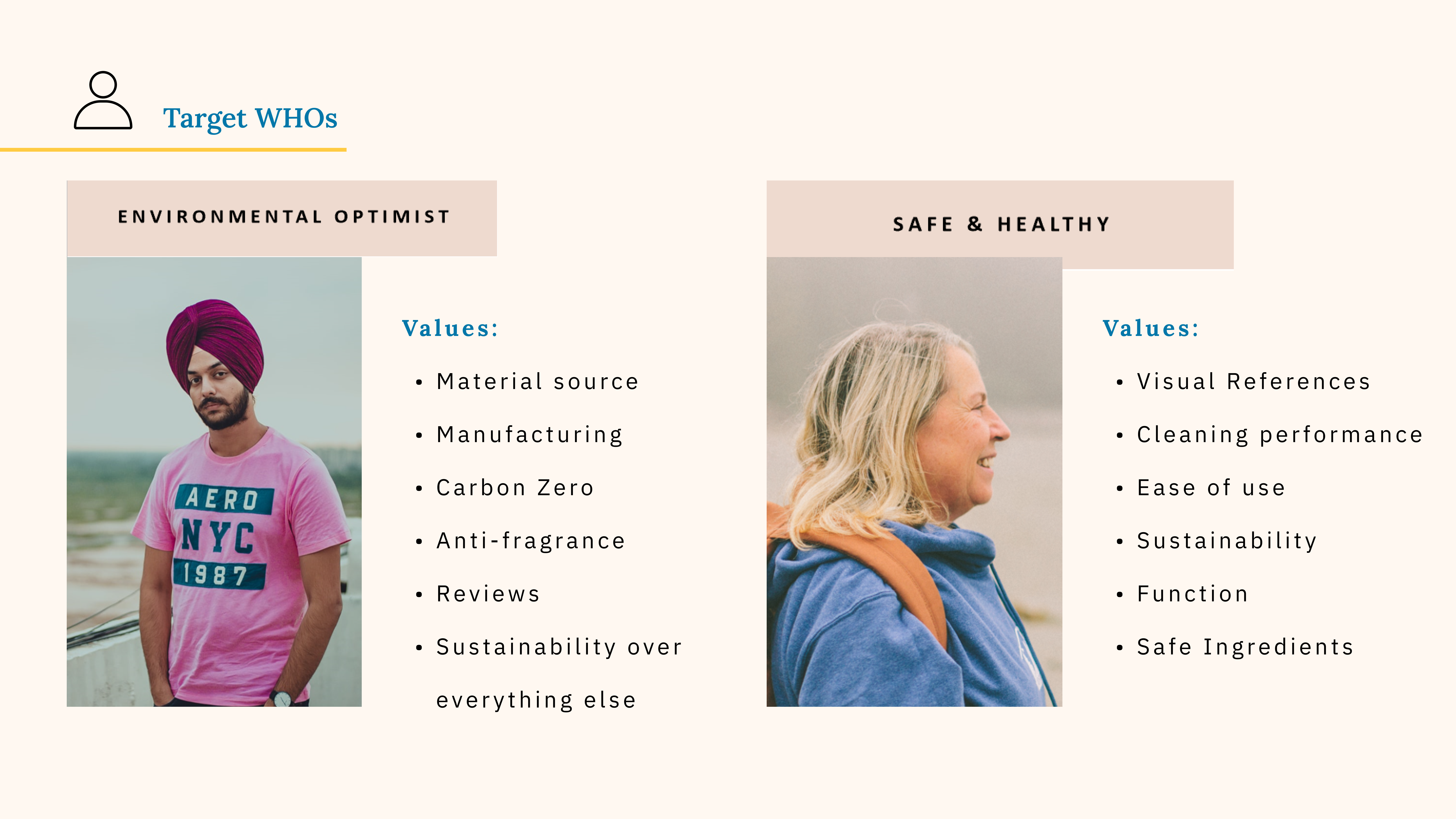
The Personas
The two main stakeholder groups are labeled as the "Environmental Optimist" and "Safe & Healthy" group, where our marketing team has gathered data that our main user demographic derives from these two types of people.
What would appeal to them?
I looked at the existing web elements that would appeal to certain user groups in order to leverage these assets for the redesign.
.png)
Consumer Complaints
I summarized some of the key findings from the the consumer insights gathered over the past three months, with the numbers indicating the amount of complaints received in that category.
.png)
.png)
Proposing Solutions
Iconography
EC30 sell products that are either scented or unscented, however this information is not clearly displayed next to products. Hence, I develop some icons that could potentially represent the scent of the fragrance.
.png)
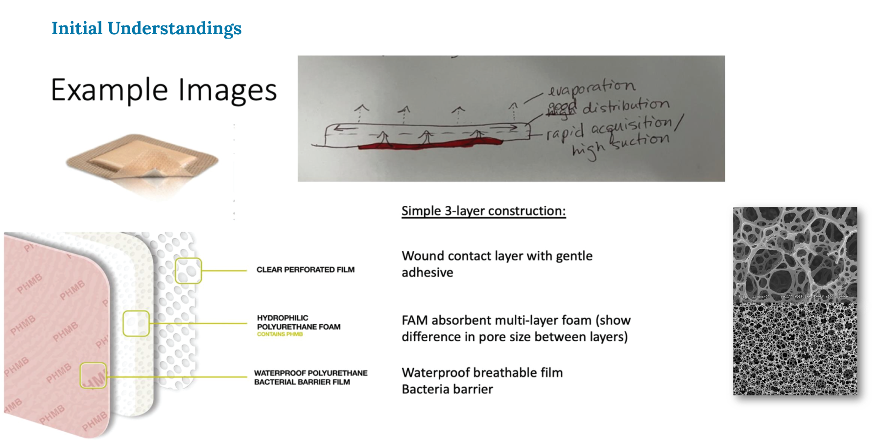
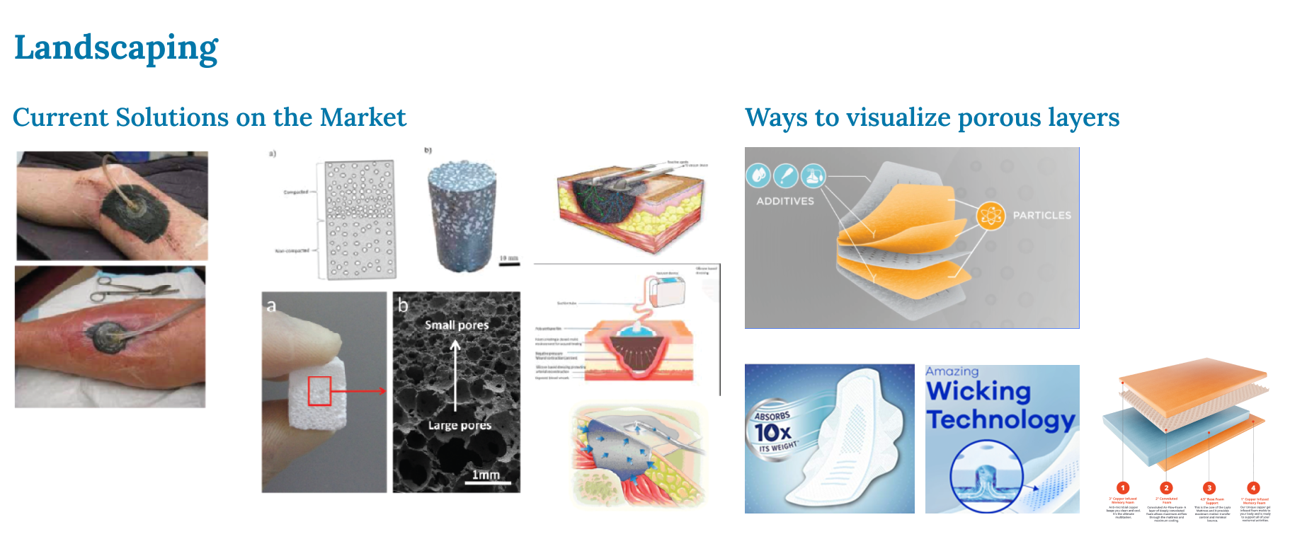
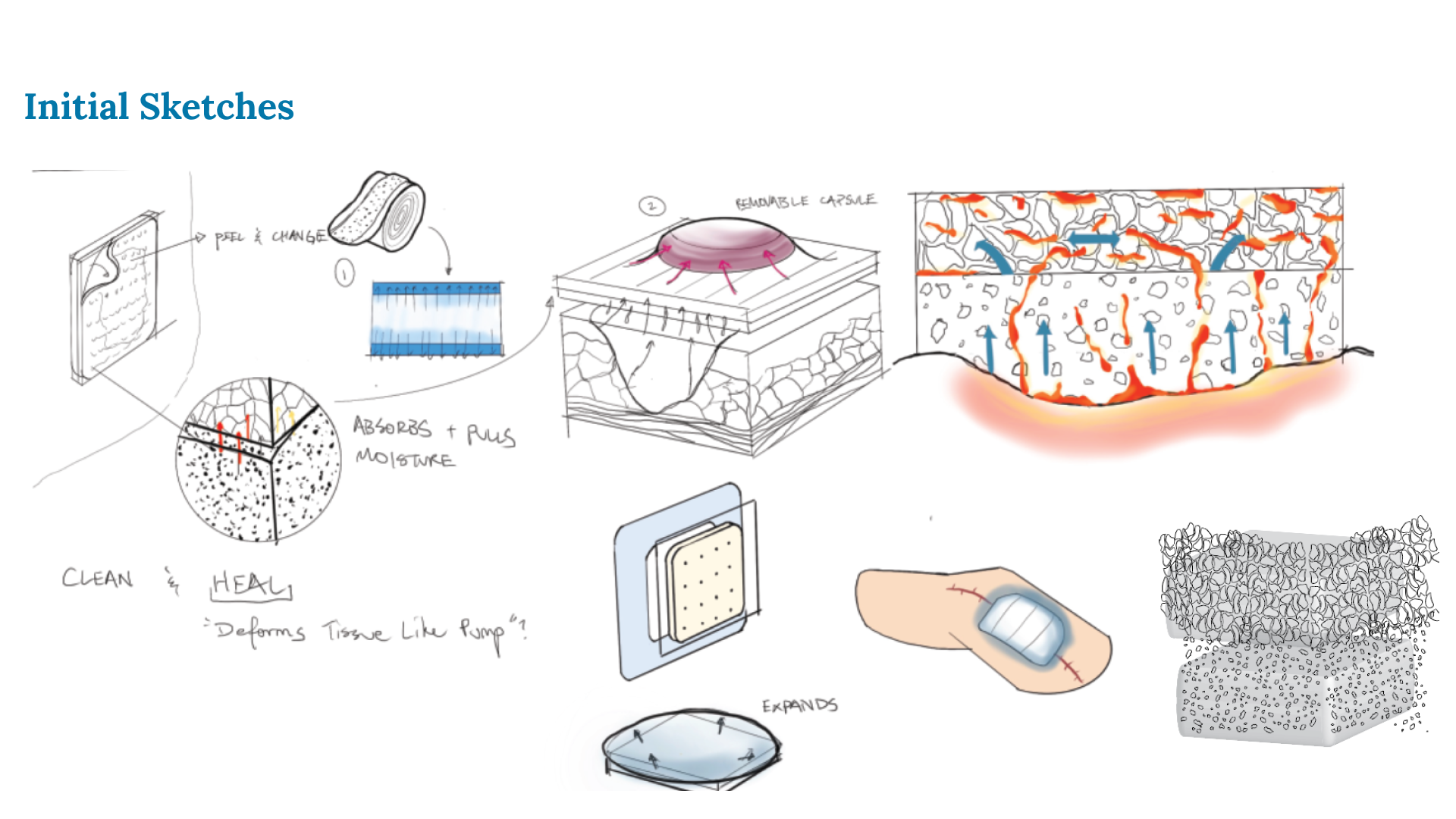
What is FAM?
FAM is the technology currently used to develop the FlexFoam for Always pads. P&G is trying to gauge if the FlexFoam can be leveraged in the wound care industry given its highly absorbent properties by pitching their technology to external partners.
The Problem
Curate a presentation deck that incorporates designed visual elements of this FlexFoam to better tell a story behind the need for FAM to break into the industry and the effectiveness of the technology.
.pptx.jpg)
.pptx%20(1).jpg)
Contextualizing the Need
What is our team trying to do?
.pptx%20(3).jpg)
The high price of chronic wound treatment.
.pptx%20(4).jpg)
The under-served populations in need for a cost-effective wound healing treatment.
.pptx%20(5).jpg)
.pptx%20(6).jpg)
The current active wound healing solutions are either too expensive or the affordable ones are do not have active wound healing properties.
.pptx%20(7).jpg)
Who are our competitiors?
.pptx%20(8).jpg)
.pptx%20(9).jpg)
The MVP that P&G proposes...
.pptx%20(10).jpg)
.pptx%20(11).jpg)
.pptx%20(12).jpg)
.pptx%20(13).jpg)
.pptx%20(14).jpg)
Takeaways
Constantly update those who you are working with during each step of your process. This helped me get feedback early on which helped me arrive at solutions quicker.
Data is immensely valuable for understanding user behavior and trends, it allows you to identify areas in the user flow that are not working for consumers.
A lot of my work involved sketching and prototyping to convey a certain idea which helped me tell a story and pitch new ideas.
Working on the FAM wound care deck gave me insight into how accurately information must be visually represented or else miscommunication can occur.